NERDWALLET
Lender match redesign - Helping small business owners borrow with confidence

MY ROLE
- Research
- Conceptualization
- Design
- A/B testing
- Dev handoff
TEAM
- Design manager
- Product manager
- 1 Engineer
DURATION
- 1 month
INTRODUCTION
What is the Lender Match Application?
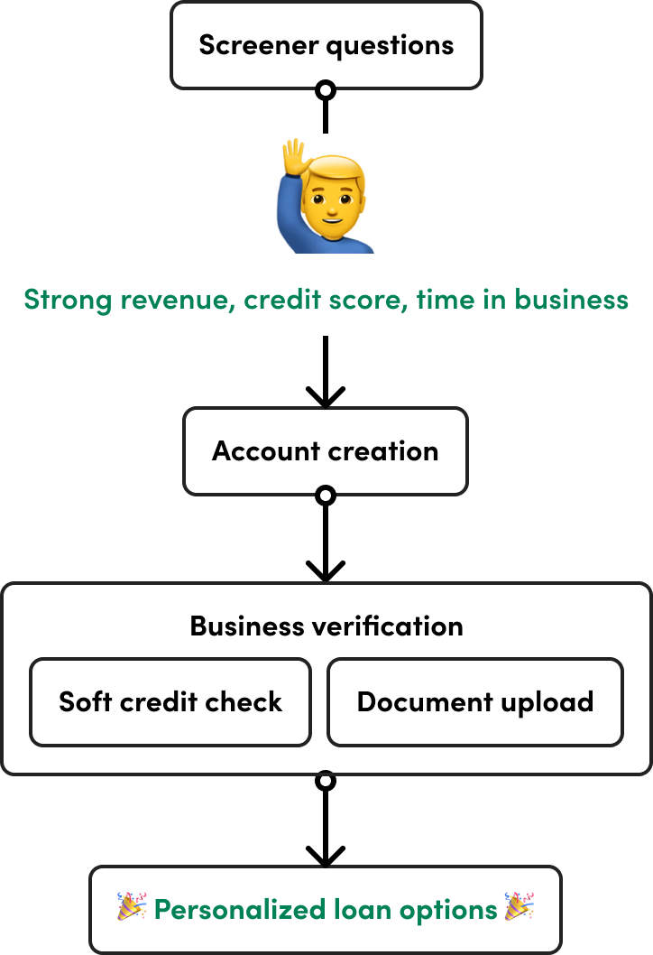
NerdWallet’s Lender Match application helps small business owners get matched with personalized loan options. After answering a short screener, users are funneled into different application flows based on their business profile.
I focused on redesigning the experience for our “power users,” applicants with strong business credentials like high revenue, good credit, and time in business. These users were the most likely to qualify for funding, and NerdWallet earned revenue when they successfully secured a loan through one of our partnered lenders.
I focused on redesigning the experience for our “power users,” applicants with strong business credentials like high revenue, good credit, and time in business. These users were the most likely to qualify for funding, and NerdWallet earned revenue when they successfully secured a loan through one of our partnered lenders.
POINTS OF DROP OFF
Problem breakdown
Even though we had high-quality leads entering the flow, many users were dropping off at critical steps like account creation, soft credit checks, and document uploads. These drop-offs represented missed opportunities, not just for users seeking funding, but for NerdWallet’s revenue as well.
Account creation: 38% dropoff
Soft credit check: 40% dropoff

Documents upload: 52% dropoff
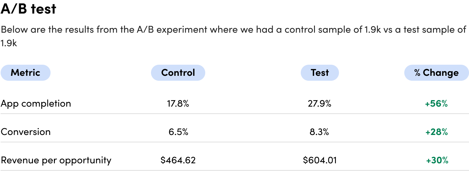
Out of 4,000 power users per month, only 17.9% completed the application—and just 6.5% converted, meaning the majority never reached the point where NerdWallet could earn revenue.
UNCOVERING THE WHYS
User research
To understand what was causing friction, I partnered with my immediate product team to conduct user research. I leveraged unguided tours and replay sessions to uncover where users got stuck and why.
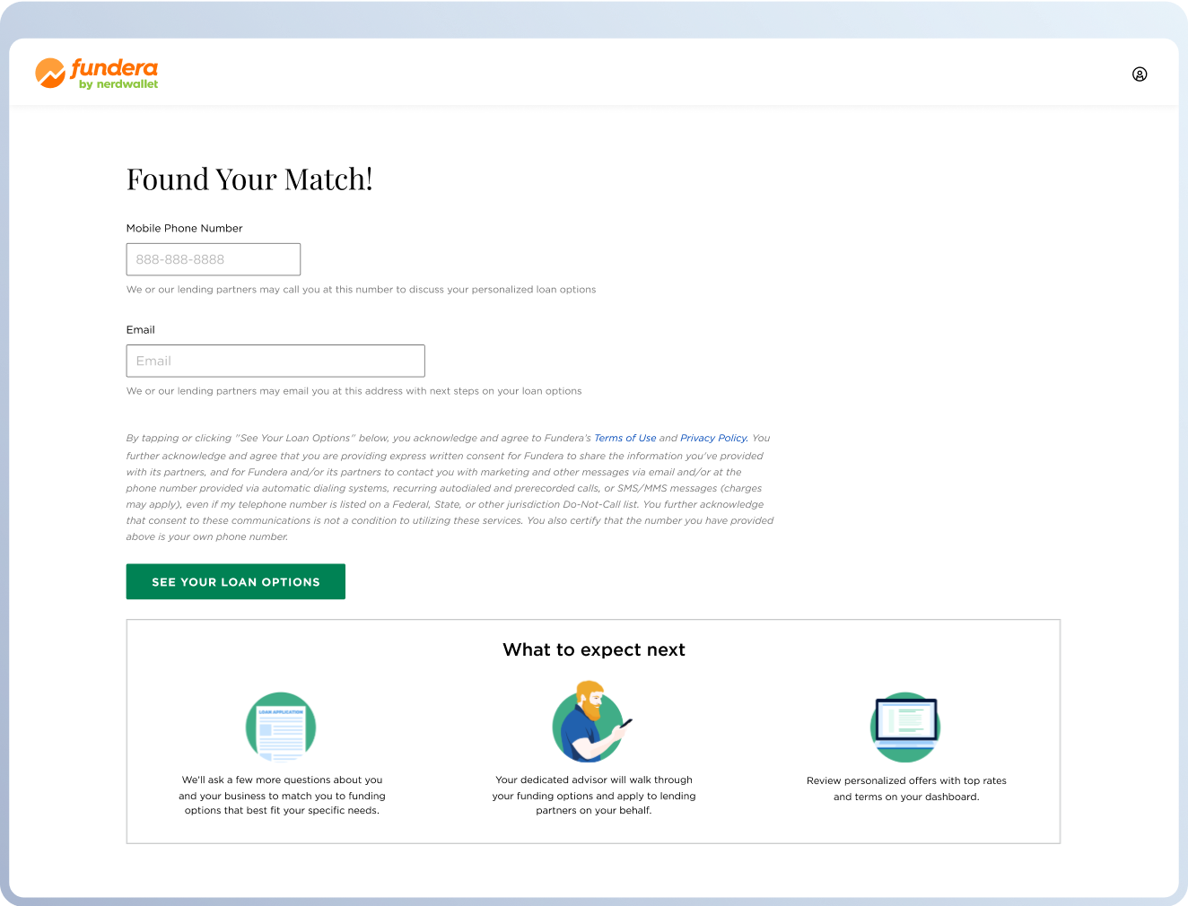
Account creation
38% drop-off
❓Will I even qualify?
The screen fails to reassure high quality users, many likely to qualify for top loan offers, leading them to drop off prematurely.
🤔 Header/content mismatch
The header and CTA suggest product offers are next, but the copy indicates more steps ahead.
Soft credit check
40% drop-off
🚫️ Too much risk
Soft credit checks can feel intimidating. Without clear reassurance, users worry about potential impacts on their credit score and hesitate to continue.
📖 Lack of transparency
The screen does not explain why the check is needed, how their information will be used, or how it benefits them, which erodes trust at a critical step.
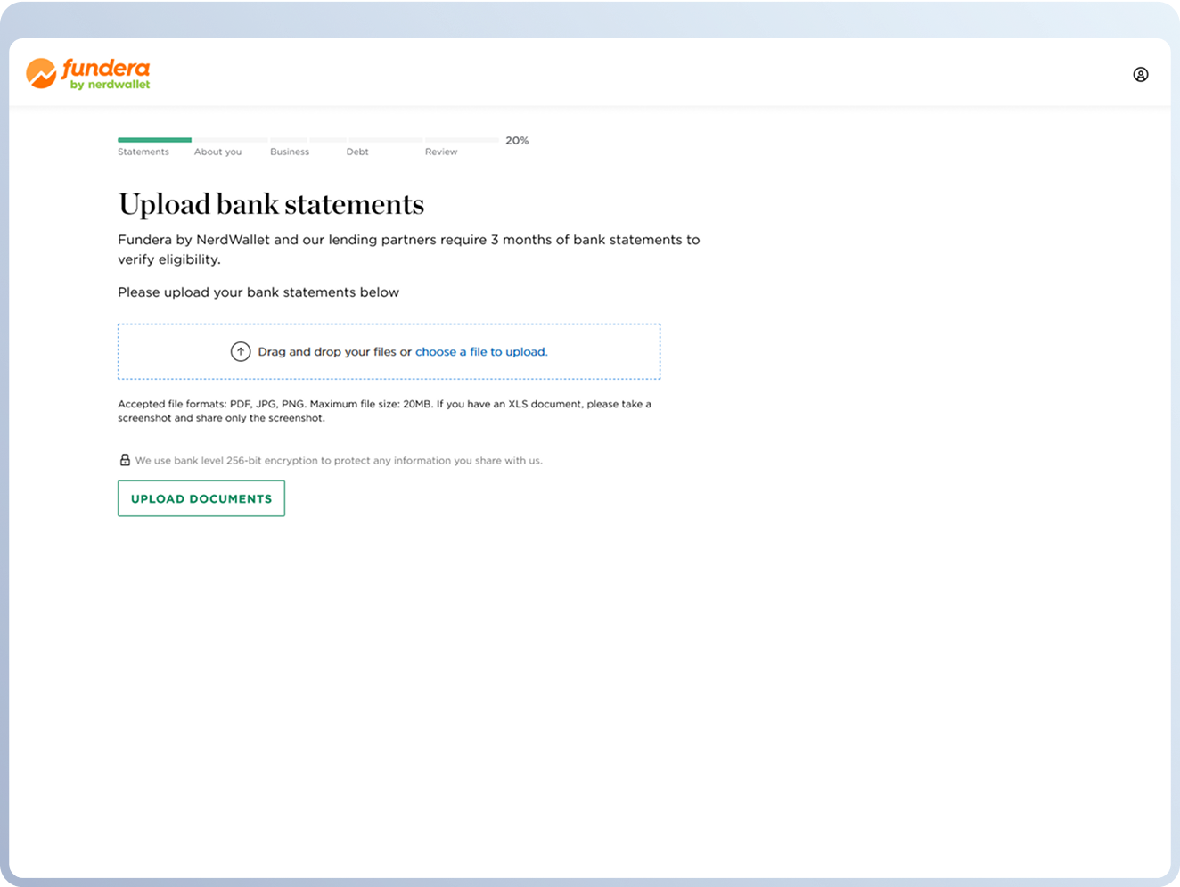
Documents upload
52% drop-off
⚠️ Trust concerns
Uploading sensitive financial documents feels risky. The screen does not reassure users about security, privacy, or how their information will be handled.
⚡ High effort required
The screen does not explain why the check is needed, how their information will be used, or how it benefits them, which erodes trust at a critical step.
TRANSLATING INSIGHTS
Iteration & Testing
With a clearer view of user pain points and business goals, I led rapid prototyping and usability testing to explore new layouts, copy, and flows. I tested different formats for security messaging, revised CTA language, and experimented with contextual tooltips to see what helped users feel more confident moving forward.

Example of user testing geared towards copy
FINAL OUTPUT
What we shipped & why
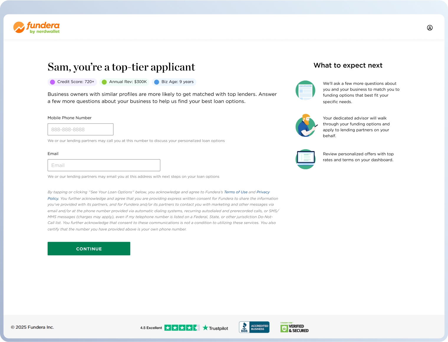
Account creation
38% → 29% drop-off
24% reduction
✨ Personalized confidence
Showed user status upfront to build trust and encourage continuation.
📍 Next steps above the fold
Moved “What to Expect Next” above the fold to reduce uncertainty.
🔒 Trust badges
Used recognizable badges to signal security and legitimacy.
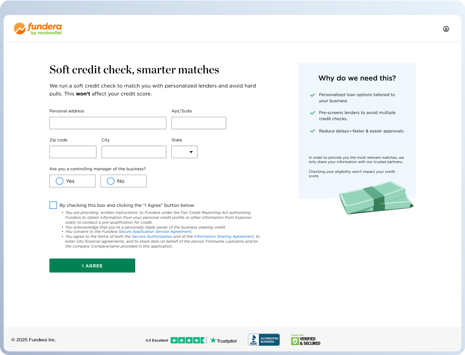
Soft credit check
40% → 31% drop-off
23% reduction
💬 Value-driven messaging
Used engaging copy to highlight benefits and encourage opt-in.
🔎 Clear transparency
Explained why the credit check is needed to build understanding and confidence.
🏃 Streamlined inputs
Moved ZIP code first to autofill city and state, reducing effort.
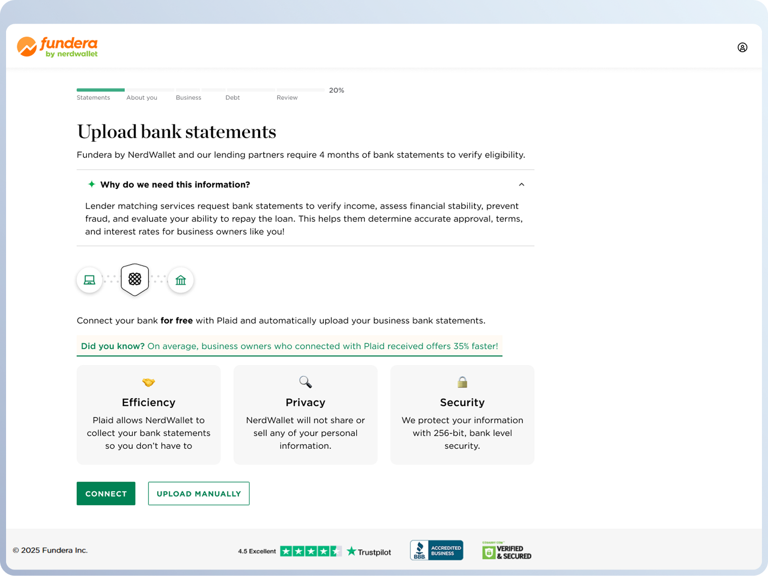
Documents upload
52% → 43% drop-off
17% reduction
👓️ Customer clarity
Explained why bank statements are needed to verify eligibility and speedy approvals.
⚙️ Plaid automation
Added Plaid linking to securely connect accounts and speed up document gathering.
💪 Data handling
Reassure users their information is encrypted, private, and never shared without consent.
BUSINESS & USER IMPACT
Post-launch results
We released each redesigned step through A/B testing to measure its effectiveness. The results gave us clear insight into how the changes impacted both user behavior and business outcomes.